Visualisations in R (base package)
- Ekta Aggarwal

- Oct 17, 2022
- 10 min read
In this tutorial we will learn how to create different plots with base functions in R.
For this we will use R's inbuilt mtcars dataset which gives information about 32 cars. We can view the mtcars data using View function
View(mtcars)Scatter Plot
A scatter plot shows the relationship between two numeric variables. One can create a scatter plot using plot function in R. The first argument takes the variable which will be represented on the x-axis and the second argument takes the variable which will be represented on the y-axis.
In the following code we are plot a scatter plot between mpg and drat variables, where mpg is on the x-axis and drat is on the y-axis.
plot(mtcars$mpg,mtcars$drat)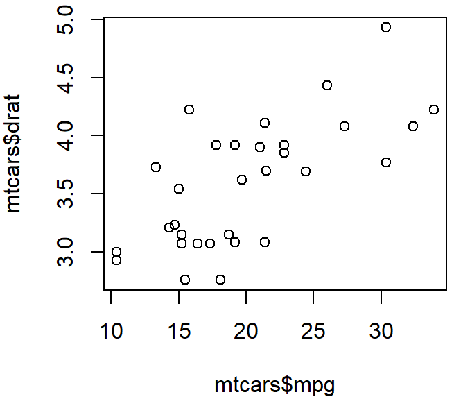
xlab, ylab, main, pch and col
If you notice that x-axis title is ‘mtcars$mpg’ and y-axis title is ‘mtcars$drat’ which looks a bit unprofessional. Thus, we can change the x-axis and y-axis titles using xlab and and ylab respectively.
One can also provide a chart title using ‘main’
Using pch one can specify the shape of the point (pch = 16 refers to circles). If you want to use a different shape for your points then you can refer to this link. Different pch shapes available in R
Xlab: Specify the title for x-axis
Ylab: Specify the title for y-axis
Main: Specify the chart title.
Col: Specify the colour of the points
Pch: Specify the shape of the points
plot(mtcars$mpg,mtcars$drat, main = 'Relationship b/w mpg and drat', xlab = "Mileage", ylab = "drat", col = 'blue', pch = 16)x
Histogram
A histogram shows the distribution of a numeric variable. One can create a histogram using hist function in R. The first argument takes the variable which will be represented on the x-axis.
In the following code we are plot a histogram of mpg variable, where the class intervals for mpg is on the x-axis and frequency corresponding to each class interval is represented by y-axis.
hist(mtcars$mpg)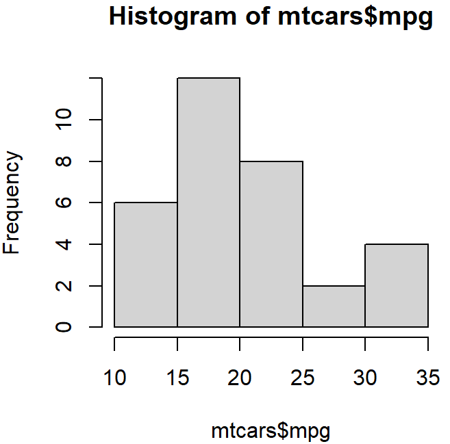
border and col
border allows us to specify the colour for the border of the bars. Col specifies the colour inside each bar of histogram.
In the above histogram we can specify the border, color, chart title and x-axis title using col, border, main and xlab respectively.
hist(mtcars$mpg,col = "white",border = "blue", main = 'Histogram', xlab = 'Mileage')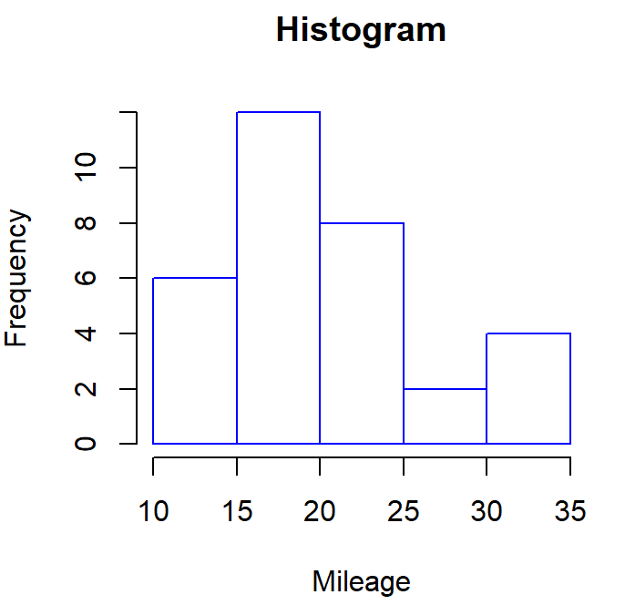
breaks
By default, histogram automatically calculates the breaks for the class intervals. However, you can specify your own class intervals using breaks parameter in a histogram.
By specifying freq = T, we are specifying that histogram should represent the frequencies.
In the following code, we are changing the breaks to : 8,13,17,20,25,29,31,34
hist(mtcars$mpg, breaks = c(8,13,17,20,25,29,31,34), freq =T,col = "white",border = "blue", main = 'Histogram', xlab = 'Mileage')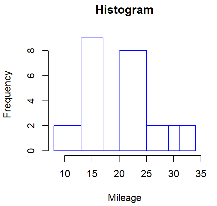
Notice, the breaks (on x-axis) for each bar in a histogram are now changed to 8,13,17,20,25,29,31,34
If we do not specify freq = T then histogram will represent the probability distribution on the y-axis for each class interval.
hist(mtcars$mpg, breaks = c(8,13,17,20,25,29,31,34),col = "white",border = "blue", main = 'Histogram', xlab = 'Mileage')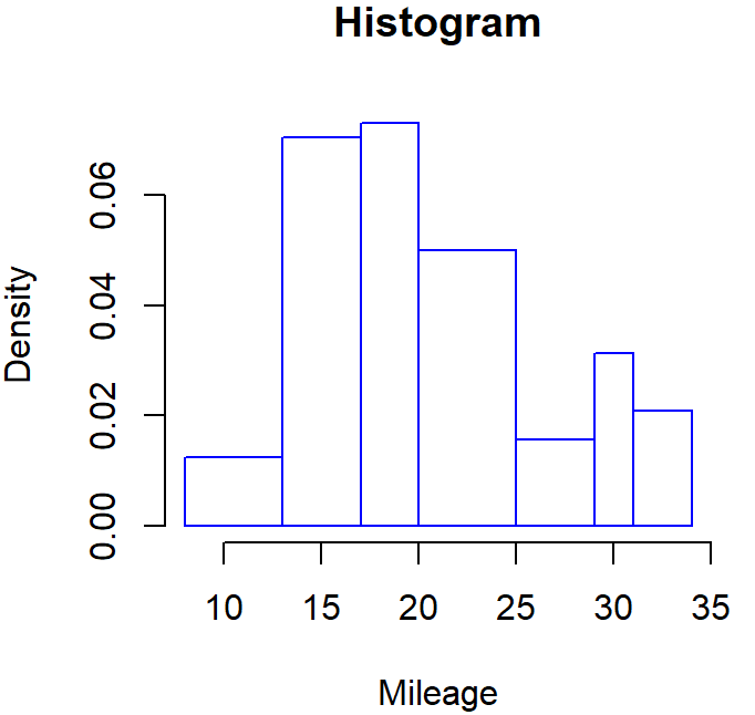
Bar Chart
A bar chart represents the frequency distribution of a categorical variable i.e., how many times each observation is repeated in a variable.
Let us create a frequency distribution of ‘am’ column in mtcars.
a = table(mtcars$am)
a
Output:
0 1
19 13
In the output we can see that 19 cars have am = 0 and 13 cars have am = 1.
One can create a bar chart using barplot function in R. The first argument takes a table or a vector whose frequencies will be represented.
In the following code we are plot a bar chart of ‘am’ variable using the dataset ‘a’ which we have saved earlier. We are also specifying the border, color, chart title and x-axis title using col, border, main and xlab respectively.
barplot(a,col = "white",border = "black", main = 'Bar Plot', xlab = 'Automatic / Manual')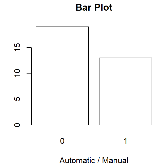
names.arg
In previous histogram we can see that x-axis labels are 0 and 1 by default. Suppose we want to give custom names i.e., 0 as ‘Automatic’ and 1 as ‘Manual’ thus, using names.arg we can specify the custom names for each bar.
barplot(a,col = "white",border = "black", main = 'Bar Plot', xlab = 'Automatic / Manual',names.arg = c("Automatic","Manual"))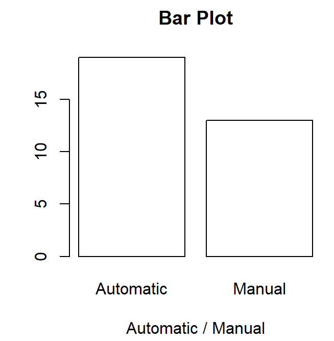
A very common mistake!
Note: Here we have to be careful while naming the bars, we knew that in ‘a’ our frequency table the first element was corresponding to ‘0’ thus the first bar would be for ‘Automatic’. Thus, in the names.arg we have written c("Automatic","Manual") i.e., Automatic is written before ‘Manual’. Here the order in which you write these elements in names.arg function can impact the misinterpretation.
barplot(a,col = "white",border = "black",
        main = 'Bar Plot', xlab = 'Automatic / Manual',names.arg = c("Manual",”Automatic”))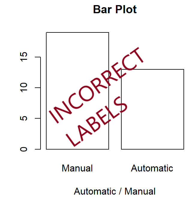
Stacked Bar Chart: Bar charts with for two – categorical variables.
Let us firstly create a 2-D frequency distribution between variables am and cyl from mtcars dataset.
a = table(mtcars$am,mtcars$cyl)
a
Output:
4 6 8
0 3 4 12
1 8 3 2
Here ‘am’ is represented as rows and ‘cyl’ is represented as columns.
Now let us use the above 2-D frequency distribution in barplot function:
barplot(a,border = "black",
        main = 'Bar Plot', xlab = 'Automatic / Manual', col = c('black','white'))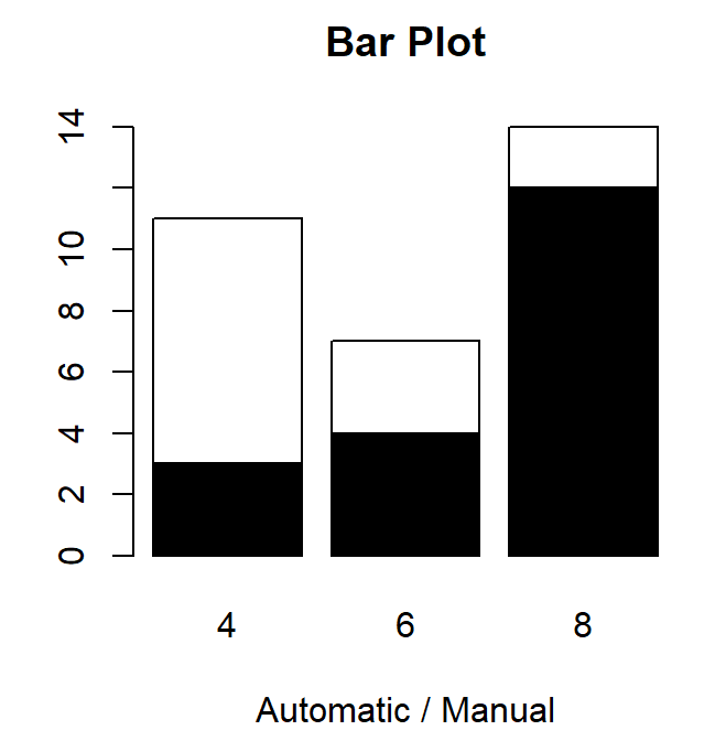
In the output we can see that there are 3 bars, representing 3 ‘cyl’ and ‘am’ is coloured inside the bars. Moreover, the bar for ‘am = 1’ is stacked on top of ‘am = 0’. Thus, it is called a stacked bar plot.
Legend.text
In the previous output it became difficult to identify which colour represents am= 0 and which represents am = 1. Thus, it is essential to specify the legend.
To show a legend in a chart we can specify legend.text and col in the respective order. i.e.,
In our table ‘a’, am = 0 appears first thus in legend.text we are specifying ‘Automatic’ first and similarly in col we are specifying ‘black’ first. Similarly, In our table ‘a’, am = 1 appears second thus in legend.text we are specifying ‘Manual’ and in col we are specifying ‘white’ in the second position.
Warning: If you switch the order of these values then the chart would be incorrect. Thus this order is highly important.
barplot(a,border = "black", main = 'Bar Plot', xlab = 'Automatic / Manual', legend.text = c("Automatic","Manual"), col = c('black','white'))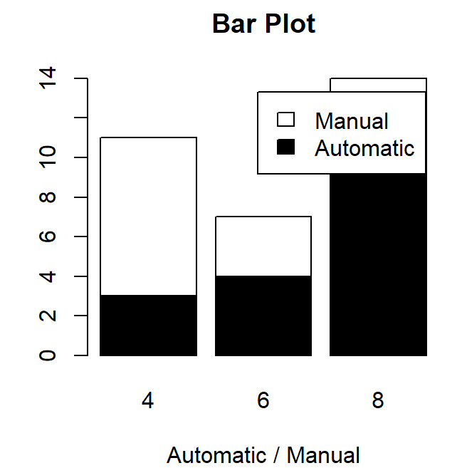
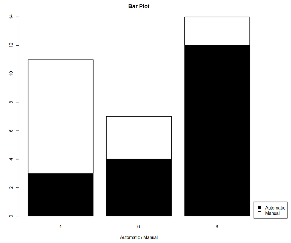
It might happen that the legend is not in the desired location of the chart, as shown above. Thus, you can specify the legend in your desired position by writing legend( ) as a separate code shown below.
Step 1: Redefine the margins of the plot. Since we want the legend to be shown on the right side thus, we have kept the 4th number slightly higher than others.
par(mar = c(5, 5, 4, 6))Step 2: Create a bar plot without any legend shown.
barplot(a,border = "black",
main = 'Bar Plot', xlab = 'Automatic / Manual', col = c('black','white'))Step 3: Create a legend on the above bar plot. Here ‘x’ represents the position of the ‘legend box’ It can take values: “bottomright”, “bottom”, “bottomleft”, “left”, “topleft”, “top”, “topright”, “right”, “center”.
Otherwise you can specify your desired coordinates for the legend by specifying x,y in the legend function.
In the code below, we are creating a legend on the ‘bottom right’ of the chart.
legend(x = 'bottomright', legend =  c("Automatic","Manual"), fill = c('black','white') ,
,xpd = T, inset = c(-0.1,0))
xpd = T defines that the legend should be placed outside the chart.
inset is the position of the legend outside the chart, however you need to play around with it.
Unstacked bar chart
Sometimes we would like to view the bar charts which are not stacked. For this we can use beside parameter. beside will give us the bar chart which is not stacked
In the following bar chart we are specifying beside = T.
barplot(a,border = "black",  main = 'Bar Plot', xlab = 'Automatic / Manual', col = c('black','white'), beside = T)

legend(x = 'topright', legend =  c("Automatic","Manual"), fill = c('black','white')  , title = 'Car Type')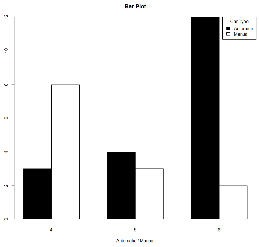
Creating Legend outside of the plot
As shown earlier we can also define the legend outside the plot using legend function.
par(mar = c(5, 5, 4, 6))

barplot(a,border = "black",
        main = 'Bar Plot', xlab = 'Automatic / Manual', col = c('black','white'), beside = T)

legend(x = 'topright', legend =  c("Automatic","Manual"), fill = c('black','white')  , title = 'Car Type',xpd = T, inset = c(-0.1,0))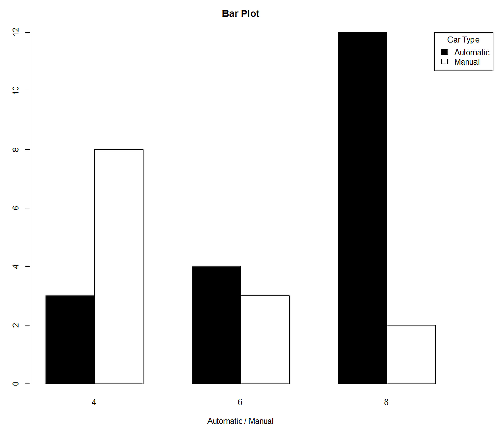
100% stacked bar chart
Let us firstly create a 2-D frequency distribution between variables am and cyl from mtcars dataset.
a = table(mtcars$am,mtcars$cyl)
a
Output:
4 6 8
0 3 4 12
1 8 3 2
Here ‘am’ is represented as rows and ‘cyl’ is represented as columns.
Suppose we want to each bar for ‘am’ to be 100% and want the colours on the basis of ‘cyl’ column.
For, since ‘am’ is in rows thus we will convert it into % using apply function, by specifying ‘1’ in second parameter.
a2 = apply(a, 1, function(x) x/sum(x)*100)
a2
Output:
0 1
4 15.78947 61.53846
6 21.05263 23.07692
8 63.15789 15.38462
In the output you can see that for am= 0 and am = 1, each of them sums up to 100.
Note: If you want to have a 100% for cyl, since ‘cyl’ is in columns of table ‘a’ thus in apply you need to specify ‘2’ as the second parameter.
apply(a,2,function(x) x/sum(x) *100)Output:
4 6 8
0 27.27273 57.14286 85.71429
1 72.72727 42.85714 14.28571
In the output you can see that for cyl = 4,6,8, each of them sums up to 100
For this tutorial let us consider
a2 = apply(a, 1, function(x) x/sum(x)*100)If we plot a bar plot, then we can see that each of the bar is leading to a total of 100 on the y-axis.
par(mar = c(5, 5, 4, 6))

barplot(a2,border = "black",   main = 'Bar Plot', xlab = 'Automatic / Manual', col = c('black','white','grey'))

legend(x = 'topright', legend =  c(4,6,8), fill = ('black','white','grey')  , title = 'Car Type', xpd = T, inset = c(-0.1,0))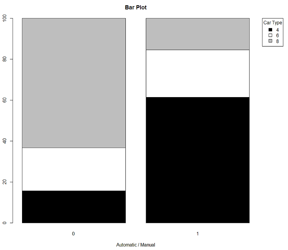
Line chart
A line chart represents the behaviour of a numeric variable with respect to time.
Let us firstly create 2 variables, time and values.
time = 2001:2020
values = c(50,40,44,28,40,55,60,63,58,52,55,65,59,50,40,52,55,57,62,66)
par()
We can plot a line chart using plot function, similar to scatter plot. However, we specify type = ‘l’ to create lines.
In the following code, we are showing time on x-axis, values on y-axis.
plot(x = time, y = values, type = 'l')
abline
By specifying abline, we can create vertical or horizontal lines on the existing chart.
In the following code, we are creating a vertical line at year = 2012 by specifying v = 2012
plot(x = time, y = values, type = 'l')
abline(v = 2012)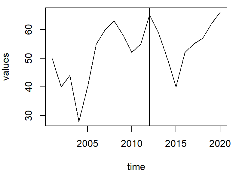
To specify multiple vertical lines, we can specify a vector. In the following code, we are creating 2 vertical lines at year = 2012 and 2015
plot(x = time, y = values, type = 'l')
abline(v = c(2012, 2015))
In the following code, we are creating a horizontal line at value = 35 by specifying h = 35
plot(x = time, y = values, type = 'l')
abline(h = 35)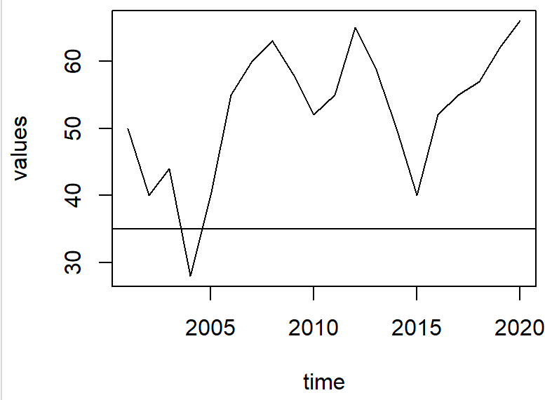
mtext
We can also highlight the points of our choice on ‘x-axis’ or y-axis by using mtext function.
Here for highlighting value = 35 by specifying ‘at = 35’ and we are showing a ‘*’ on y-axis by specifying side = 2.
plot(x = time, y = values, type = 'l')
mtext("*", side = 2, at = 35)
abline(h = 35)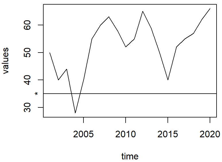
For highlighting something on x-axis we use side= 1.
In the following code, for highlighting value = 2012 by specifying ‘at = 2012’ and we are showing a ‘*’ on y-axis by specifying side = 1.
plot(x = time, y = values, type = 'l')
mtext("*", side = 1, at = 2012)
abline(v = 2012)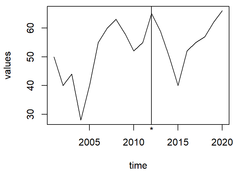
lty and lwd
lty : Specify the line type.
lwd: Specify the width of the line.
You can refer to this link for specifying lty
plot(x = time, y = values, type = 'l', col = 'navyblue',
     lty = 2, lwd = 3)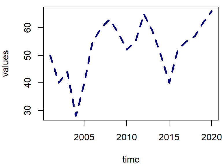
Multiple line chart
Using lines function one can create multiple lines on an existing chart.
Let us create a basic line chart with line colour navyblue.
plot(x = time, y = values, type = 'l', col = 'navyblue', lty = 2, lwd = 3)Now let us create another line chart between time and values+3, in dark green colour with lwd = 2.
lines(time, values+3, col = 'darkgreen', lwd = 2)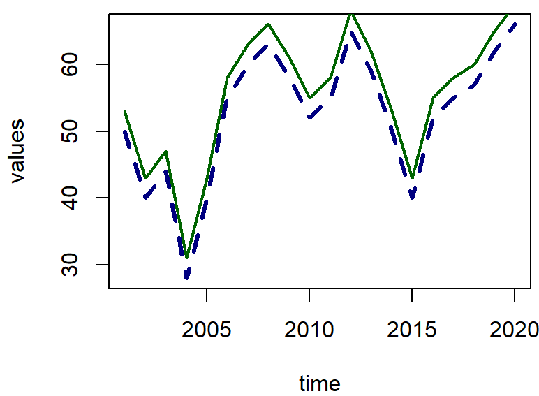
Creating Legend outside of the plot
Now we can create a legend for the plot
To create a legend outside the plot, say on the right side, thus we are setting up the margins on each side using par( ) function. Since we want the legend of the right thus, we are setting the fourth parameter a bit higher.
par(mar = c(5, 4, 4, 7))Using legend( ) we are creating a legend on right side.
plot(x = time, y = values, type = 'l', col = 'navyblue',
lty = 2, lwd = 3)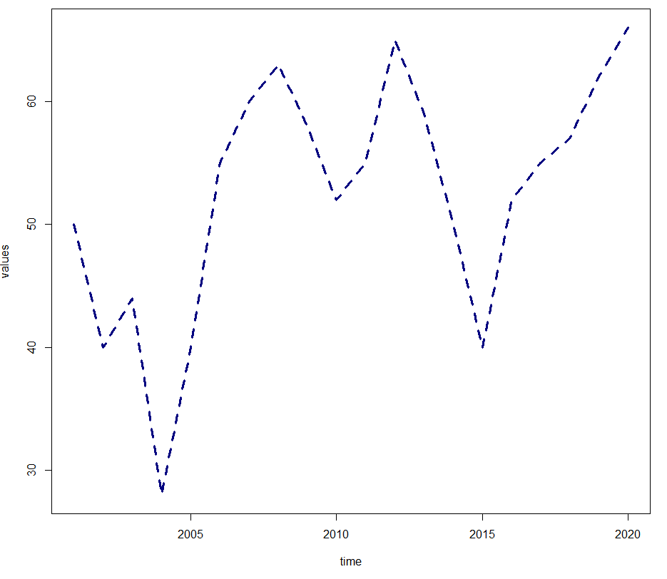
lines(time, values+3, col = 'darkgreen', lwd = 2)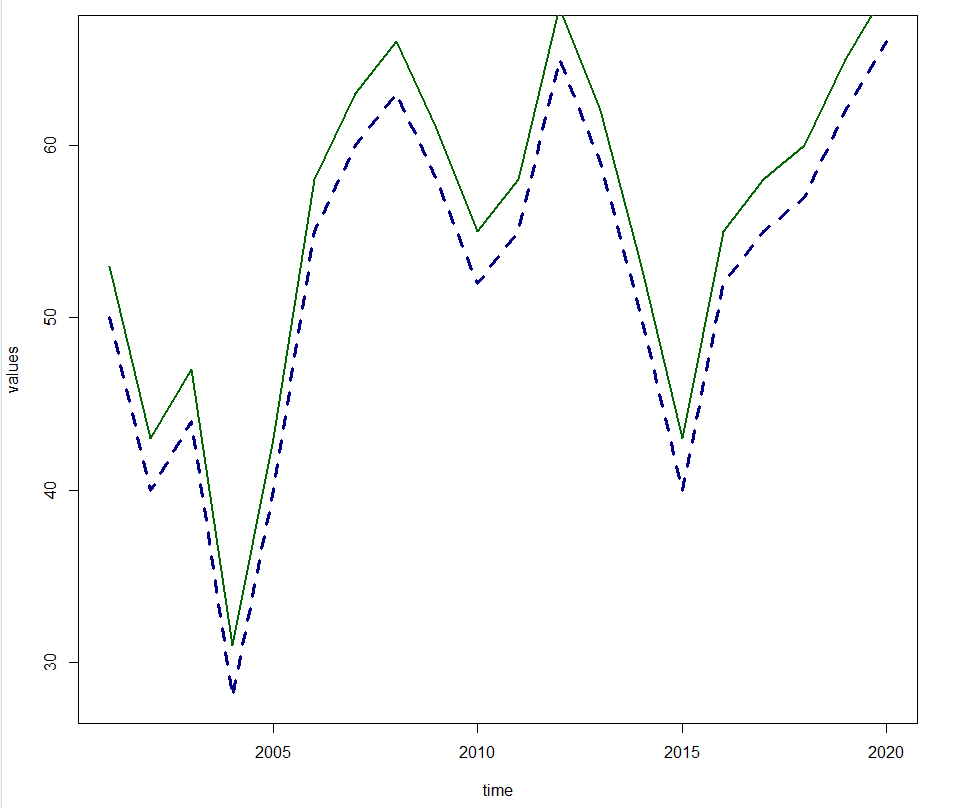
legend(x = 'right',legend = c("Series 1","Series 2"),
       col = c('navyblue','darkgreen'), lwd = c(3,2) ,
       lty = c(2,1) ,xpd = T, inset = c(-0.16,0))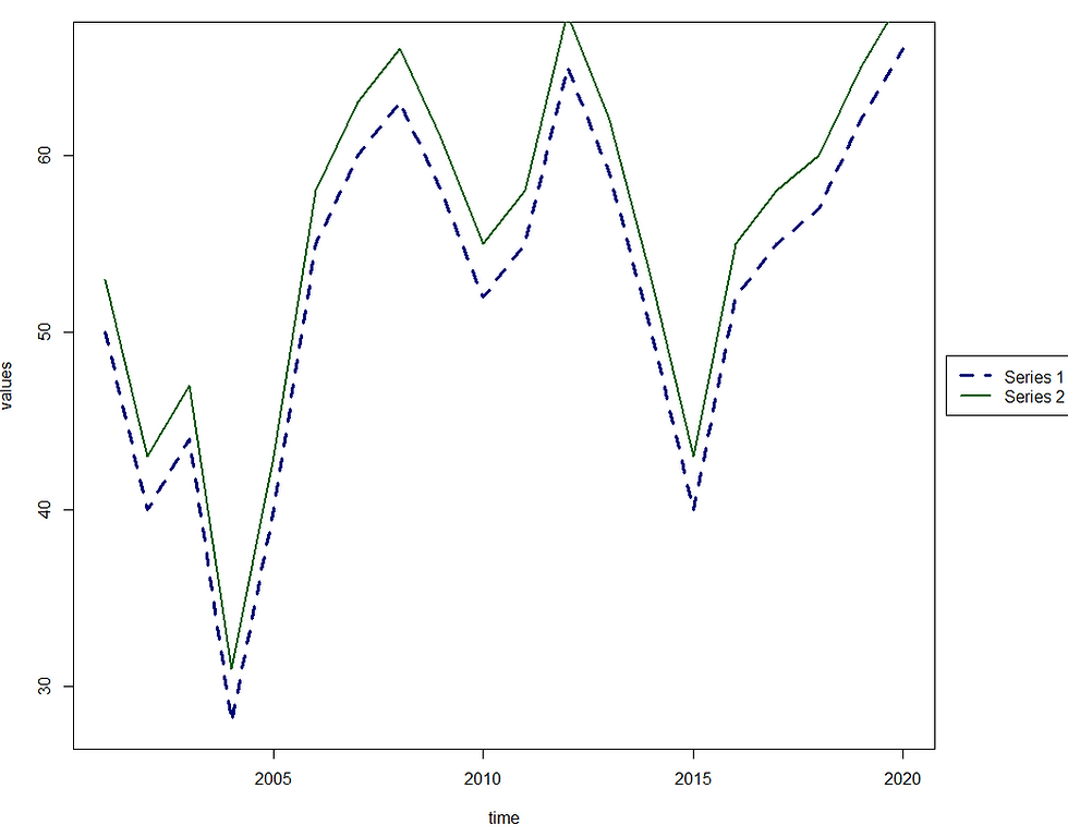
Dual axis line chart
Let us create another variable called ‘Sales’.
Sales = c(20000,30000,15000,40000,24000,44000,36000,30000,29000,38000,40000,45000,50000,39000,51000,34000, 31000,28000,40000,45000)A dual axis line chart is used to plot 2 different lines with respect to time. However, both the variables can have different scales. Here Sales are in thousands while, our variable’values are less than 100. Thus a dual axis line chart will have 2 different y-axis.
Step 1: Let us set the margins
par(mar = c(5.3, 4.3, 4.3, 11))Step 2: Let us create a base plot between time and values.
plot(x = time, y = values, type = 'l', col = 'navyblue', lty = 2, lwd = 3)Step 3: Let us specify par(new = T) to indicate the new plot should not be created.
par(new=TRUE) Step 4: Let us create a plot using plot function. Note we have specified axis = F and xlab = “” and ylab = “”. So that there are no x-axis and y-axis title. Axis = F indicates that we do not want to use the same y-axis of previous plot (i.e, the one on the left). Rather use a different y-axis (i.e., the one on the right)
plot(time, Sales, col = 'darkgreen', lwd = 2, type = "l", axes = F, xlab = "", ylab = "")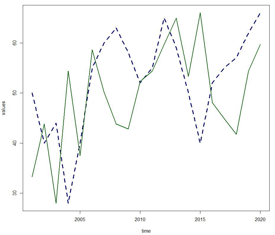
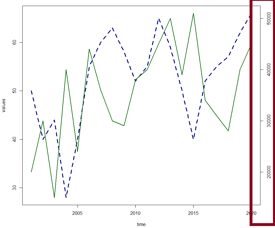
Step 5: Create the tick-marks for our secondary y-axis by using pretty( ) function.
range( ) functions returns the minimum and maximum Sales values, while pretty function creates a sequence using range( ) function.
To specify that we need the tickmarks on secondary y-axis on the right, thus we write side = 4.
axis(side=4, at = pretty(range(Sales)))The highlighted red section in the image below is due to the result of above code.
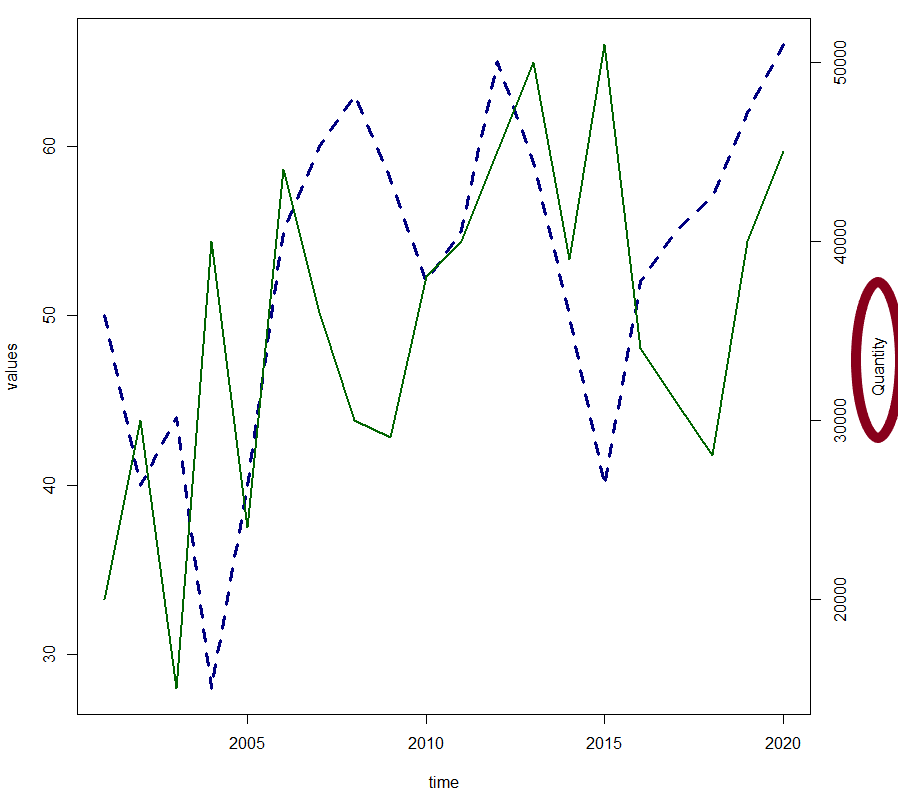
Step 6: Specify the title to secondary y-axis.
We can provide the title to our secondary y-axis using mtext function, by specyifying side = 4.
mtext("Quantity", side=4, line=3)The highlighted red section in the image below is due to the result of above code.
Step 7: Add the legend.
legend(x = 'topright',legend =  c("Series 1","Series 2"), col = c('navyblue','darkgreen'), lwd = c(3,2) ,
       lty = c(2,1) ,xpd = T, inset = c(-0.3,0))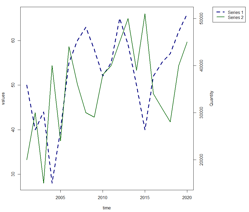
Boxplot
A boxplot represents the distribution of numeric variable and highlights the outliers.
Using boxplot function, one can create a boxplot in R.
In the following code we are creating a boxplot for ‘mpg’ variable.
boxplot(mtcars$mpg)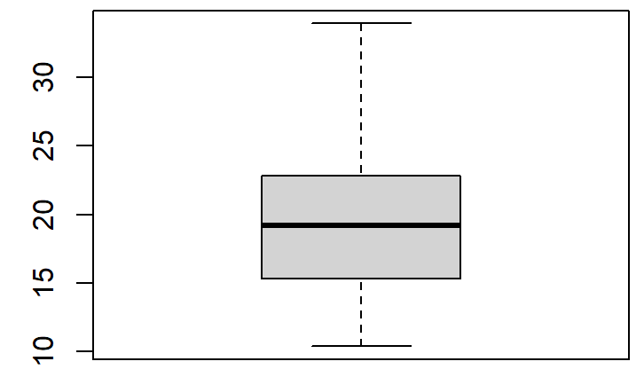
By specifying horizontal = T, one can create a horizontal boxplot.
boxplot(mtcars$mpg, horizontal = T)
We can change the colour of the boxplot by using ‘col’
boxplot(mtcars$mpg, horizontal = T, col = 'white')
Parallel Boxplots
Parallel boxplots are for a numeric variable classified by a categorical variable. We can create parallel boxplot by specifying our categorical variable after “~” symbol.
Here we are creating a boxplot for ‘mpg’, split by our categorical variable ‘am’
boxplot(mtcars$mpg~mtcars$am)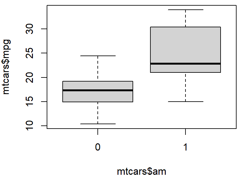
You can specify the x-axis and y-axis labels using xlab and ylab respectively for all the charts.


Comments