Matplotlib - Completely explained.
- Ekta Aggarwal

- Jan 31, 2021
- 9 min read
Updated: Feb 14, 2022
In this tutorial we will learn how to create impressive visualisations in Python using matplotlib.
Key topics covered:
Line Graphs
Line graphs are used when we have time series data. On x-axis we have our time frame and on y-axis we have a continuous variable.
They are used to understand the trend, seasonality and performance over time.
For this, we will use following CSV file which comprises of stock prices of various companies for December 2017.
Let us firstly read our CSV file:
import pandas as pd
stock_prices = pd.read_csv("Stock_prices_dec2017.csv",parse_dates=True)
We are importing pyplot module of library matplotlib with alias name plt. %matplotlib inline is used in Jupyter notebooks to view the graphs in the notebook.
import matplotlib.pyplot as plt
%matplotlib inline
Task: Plotting a line graph for volume traded for apple in December 2017.
In the following code plt.subplots( ) are used to generate a figure area, we shall cover subplots in more detail later in this tutorial.
Using plot( ) function we can create our line graphs
plot(X-axis time series, Y-axis values )
On X axis we have plotted day column (for AAPL i.e. Apple)
On Y axis we have plotted volume column
Using plt.show( ) we are directing Python to show our plot!
fig, ax = plt.subplots()
ax.plot(stock_prices.loc[stock_prices.Name == "AAPL",'day'],stock_prices.loc[stock_prices.Name == "AAPL",'volume'])
plt.show()
Plotting multiple lines on one graph
Task : Plot Apple and Microsoft's volume in a single graph.
We can plot multiple lines in a single graph using multiple plot( ) statements.
fig, ax = plt.subplots()

ax.plot(stock_prices.loc[stock_prices.Name == "AAPL",'day'],stock_prices.loc[stock_prices.Name == "AAPL",'volume'])

ax.plot(stock_prices.loc[stock_prices.Name == "MSFT",'day'],stock_prices.loc[stock_prices.Name == "MSFT",'volume'])

plt.show()
Choosing markers
To highlight different lines we can add markers by setting marker = "<markersymbol>"
<markersymbol> "o" creates points.
You can refer to Python's original documentation to explore various marker symbols: Matplotlib markers
fig, ax = plt.subplots()

ax.plot(stock_prices.loc[stock_prices.Name == "AAPL",'day'],stock_prices.loc[stock_prices.Name == "AAPL",'volume'],
        marker = "o")

ax.plot(stock_prices.loc[stock_prices.Name == "MSFT",'day'],stock_prices.loc[stock_prices.Name == "MSFT",'volume'],
marker = "^")

plt.show()
Choosing linestyle
To enhance our line graphs we can add line-styles by using linestyle = "<linestyle pattern"
Various line styles can be found in matplotlib's documentation: Line style references in matplotlib
fig, ax = plt.subplots()
ax.plot(stock_prices.loc[stock_prices.Name == "AAPL",'day'],stock_prices.loc[stock_prices.Name == "AAPL",'volume'],
        marker = "o",linestyle = "dotted")
ax.plot(stock_prices.loc[stock_prices.Name == "MSFT",'day'],stock_prices.loc[stock_prices.Name == "MSFT",'volume'],
        linestyle = "--", marker = "^")
plt.show()
Choosing color
Instead of going for default colors we can play around with the colors by specifying color = "<colorcode>"
Following is the link to explore colors available in matplotlib: Matplotlib colors
fig, ax = plt.subplots()
ax.plot(stock_prices.loc[stock_prices.Name == "AAPL",'day'],stock_prices.loc[stock_prices.Name == "AAPL",'volume'],
        marker = "o",color = 'red')
ax.plot(stock_prices.loc[stock_prices.Name == "MSFT",'day'],stock_prices.loc[stock_prices.Name == "MSFT",'volume'],
        linestyle = "--", marker = "^",color = "green")
plt.show()
Adding a legend
In case of multiple line graphs it becomes difficult to comprehend which line is representing which variable. Thus we can add a legend to our plots.
For this firstly we need to define labels in each of plot( ) - These labels will be displayed along with the color and linestyle.
To view the legend we need to specify .legend( )
fig, ax = plt.subplots()

ax.plot(stock_prices.loc[stock_prices.Name == "AAPL",'day'],stock_prices.loc[stock_prices.Name == "AAPL",'volume'],
        marker = "o",color = 'red',label = "AAPL")

ax.plot(stock_prices.loc[stock_prices.Name == "MSFT",'day'],stock_prices.loc[stock_prices.Name == "MSFT",'volume'],
        linestyle = "--", marker = "^",color = 'green',label = "MSFT")

ax.legend()

plt.show()
Adding title, x-axis and y-axis labels
It becomes more elaborate when x axis , y axis labels and title are present. We can add the following using:
set_xlabel : Defining the labels for x-axis.
set_ylabel : Defining the labels for y-axis .
set_title: Defining the title of the plot
fig, ax = plt.subplots()

ax.plot(stock_prices.loc[stock_prices.Name == "AAPL",'day'],stock_prices.loc[stock_prices.Name == "AAPL",'volume'],
        marker = "o",color = 'red',label = "AAPL")
ax.legend(loc="upper right")

ax.plot(stock_prices.loc[stock_prices.Name == "MSFT",'day'],stock_prices.loc[stock_prices.Name == "MSFT",'volume'],
        linestyle = "--", marker = "^",color = 'green',label = "MSFT")
ax.legend(loc="upper right")

ax.set_xlabel("Day")
ax.set_ylabel("Volume traded")
ax.set_title("Volume Traded in Dec 2017")

plt.show()
Subplots
Graphs become too messy or uninteresting when they are saved individually at different places. We can show multiple plots together by dividing our canvas (plotting area) in grids.
For eg. A 2*2 grid denotes 2 rows and 2 columns i.e.4 graphs can be viewed at one go!
In plt.subplots( ) we define the dimensions of our grid.
Next for each ax we need to specify the graph location:
ax[0,0] means show the graph in 1st row and 1st column.
ax[1,0] means show the graph in 2nd row and 1st column.
(Remember? Python indexing starts from 0)
Note: We have to define legend ,title, xlabels and ylabels separately for each ax[0,0] , ax[0,1] , ax[1,0] and ax[1,1] for a 2X2 grid.
fig, ax = plt.subplots(2,2)

ax[0,0].plot(stock_prices.loc[stock_prices.Name == "AAPL",'day'],stock_prices.loc[stock_prices.Name == "AAPL",'volume'],
        marker = "o",color = 'red',label = "AAPL")
ax[0,0].legend(loc="best")

ax[0,1].plot(stock_prices.loc[stock_prices.Name == "MSFT",'day'],stock_prices.loc[stock_prices.Name == "MSFT",'volume'],
        linestyle = "--", marker = "^",label = "MSFT")
ax[0,1].legend(loc="best")

ax[1,0].plot(stock_prices.loc[stock_prices.Name == "AMZN",'day'],stock_prices.loc[stock_prices.Name == "AMZN",'volume'],
        linestyle = "dotted",color = 'green',label = "AMZN")
ax[1,0].legend(loc="best")

ax[1,1].plot(stock_prices.loc[stock_prices.Name == "NFLX",'day'],stock_prices.loc[stock_prices.Name == "NFLX",'volume'],
        linestyle = "dotted", marker = ".",color = "orange",label = "NFLX")
ax[1,1].legend(loc="best")

plt.show()
Subplots with 2 rows and 1 column:
When we are creating subplots with 1 single column (but multiple rows) then we can specify ax[N] where N is the position at which you want the graph.
Eg. For 1st row we have defined ax[0] and for 2nd for ax[1]
Notice that in ax[0] and ax[1] we have created multiple line graphs.
fig, ax = plt.subplots(2,1)

ax[0].plot(stock_prices.loc[stock_prices.Name == "AAPL",'day'],stock_prices.loc[stock_prices.Name == "AAPL",'volume'],
        marker = "o",color = 'red')
ax[0].plot(stock_prices.loc[stock_prices.Name == "MSFT",'day'],stock_prices.loc[stock_prices.Name == "MSFT",'volume'],
        linestyle = "--", marker = "^")

ax[1].plot(stock_prices.loc[stock_prices.Name == "AMZN",'day'],stock_prices.loc[stock_prices.Name == "AMZN",'volume'],
        linestyle = "dotted",color = 'green')
ax[1].plot(stock_prices.loc[stock_prices.Name == "NFLX",'day'],stock_prices.loc[stock_prices.Name == "NFLX",'volume'],
        linestyle = "dotted", marker = ".",color = "orange")

ax[0].set_ylabel("Volume")
ax[1].set_ylabel("Volume")
ax[1].set_xlabel("Day")
plt.show()
Sharing y -axis or x-axis range
In the above graph y axis have different range in different subplots. To ensure y-axis has same range in all the subplots we define sharey = True in subplots( ) function.
Similarly for having same x-axis range in all the graphs we define sharex = True
fig, ax = plt.subplots(2,1,sharey = True)

ax[0].plot(stock_prices.loc[stock_prices.Name == "AAPL",'day'],stock_prices.loc[stock_prices.Name == "AAPL",'volume'],
        marker = "o",color = 'red')
ax[0].plot(stock_prices.loc[stock_prices.Name == "MSFT",'day'],stock_prices.loc[stock_prices.Name == "MSFT",'volume'],
        linestyle = "--", marker = "^")

ax[1].plot(stock_prices.loc[stock_prices.Name == "AMZN",'day'],stock_prices.loc[stock_prices.Name == "AMZN",'volume'],
        linestyle = "dotted",color = 'green')
ax[1].plot(stock_prices.loc[stock_prices.Name == "NFLX",'day'],stock_prices.loc[stock_prices.Name == "NFLX",'volume'],
        linestyle = "dotted", marker = ".",color = "orange")

ax[0].set_ylabel("Volume")
ax[1].set_ylabel("Volume")
ax[1].set_xlabel("Day")

plt.show()
For the next part of the tutorial we will use another data: Amazon's stock prices for 5 years.
Let us firstly read the CSV file:
import pandas as pd
stock_prices = pd.read_csv("Amazon_5_yr_stock_prices.csv")
Our data comprises of stock prices- opening, closing and day's highest and lowest prices for 5 years.
stock_prices.head()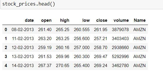
Let us convert our date column from an object to a datetime format.
import datetime
stock_prices['date'] = stock_prices['date'].apply(lambda x: datetime.datetime.strptime(x, '%d-%m-%Y'))
Dual axis and twinning the axis
To understand what is dual axis let us firstly do the following:
Task: Plot Stock volume and opening prices in a single graph.
To do so we need to plot a multiple line graph as follows.
fig, ax = plt.subplots()
ax.plot(stock_prices.date,stock_prices.volume)
ax.plot(stock_prices.date,stock_prices.open)
ax.set_xlabel('Year')
ax.set_ylabel('Volume traded')
plt.show()
But here we can hardly make any guesses about the opening prices - This is because of the scale of the volume - which is in millions while opening prices are in hundreds.
To visualize both of them in one graph - we can have 2 y-axis (one one the left hand side and another one on right hand side)
To use dual axis or twin axis - we have defined another axis (ax2) using ax.twinx() which means that axis 2 (ax2) will be shared on the same plot as axis 1 (ax) i.e. both are twins.
Then we have plotted our opening prices on second axis (ax2)
fig, ax = plt.subplots()
ax.plot(stock_prices.date,stock_prices.volume,color = 'green')
ax.set_xlabel('Year')
ax.set_ylabel('Volume Traded')
ax2 = ax.twinx()
ax2.plot(stock_prices.date,stock_prices.open,color = 'red')
ax2.set_ylabel('Opening price')

plt.show()
Coloring the X and Y axis tick labels
We can also beautify our visualisations by coloring the tick labels on X and Y axis by using tick_params(axis name, colors = "<colorname>" )
fig, ax = plt.subplots()
ax.plot(stock_prices.date,stock_prices.volume,color = 'green')
ax.set_xlabel('Year')
ax.set_ylabel('Volume Traded')
ax.tick_params('y', colors='green')
ax2 = ax.twinx()
ax2.plot(stock_prices.date,stock_prices.open,color = 'red')
ax2.set_ylabel('Opening price')
ax2.tick_params('y', colors='red')
plt.show()
Annotating data
To particularly point out a point we can also annotate our data using annotate( ) function.
In our graph we are annotating the date 1st Jan 2017, with y-axis taking value 700 - Annotation text being "2017 begins"
fig, ax = plt.subplots()
ax.plot(stock_prices.date,stock_prices.volume,color = 'green')
ax.set_xlabel('Year')
ax.set_ylabel('Volume Traded')
ax.tick_params('y', colors='green')
ax2 = ax.twinx()
ax2.plot(stock_prices.date,stock_prices.open,color = 'red')
ax2.set_ylabel('Opening price')
ax2.tick_params('y', colors='red')
ax2.annotate("2017 begins", xy=[datetime.datetime(2017,1,1), 700])
plt.show()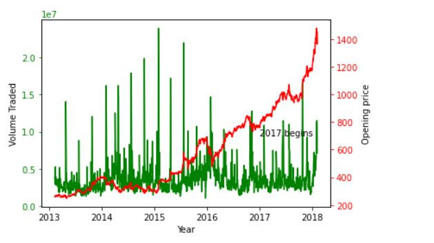
In the above graph our annotation is not clearly visible and is overlapping with the graph.
To define our location of where the text should be located we have defined our X-Y coordinates using xytext in annotate( ) Using arrowprops = { } we can display an arrow pointing out the coordinate and annotated text.
fig, ax = plt.subplots()
ax.plot(stock_prices.date,stock_prices.volume,color = 'green')
ax.set_xlabel('Year')
ax.set_ylabel('Volume Traded')
ax.tick_params('y', colors='green')
ax2 = ax.twinx()
ax2.plot(stock_prices.date,stock_prices.open,color = 'red')
ax2.set_ylabel('Opening price')
ax2.tick_params('y', colors='red')
ax2.annotate("2017 begins", xy=[datetime.datetime(2017,1,1), 700],xytext=(datetime.datetime(2018,1,1), 0.2),
            arrowprops={})
plt.show()
We can also format how our arrow in arrowprops looks.
We have used the format "arrowstyle as ->" and "color as blue"
You can find more styles on: Matplotlib annotate
fig, ax = plt.subplots()
ax.plot(stock_prices.date,stock_prices.volume,color = 'green')
ax.set_xlabel('Year')
ax.set_ylabel('Volume Traded')
ax.tick_params('y', colors='green')
ax2 = ax.twinx()
ax2.plot(stock_prices.date,stock_prices.open,color = 'red')
ax2.set_ylabel('Opening price')
ax2.tick_params('y', colors='red')
ax2.annotate("2017 begins", xy=[datetime.datetime(2017,1,1), 700],xytext=(datetime.datetime(2018,1,1), 0.2),
            arrowprops={"arrowstyle":"->", "color":"blue"})
plt.show()
For the next set of codes we will use the file: mtcars.CSV
Let us read our CSV file:
import pandas as pd
mtcars = pd.read_csv("mtcars.csv")
Scatter Plots
A scatter plot is a 2X2 representation of numeric columns which are continuous in nature. It is used to establish how the 2 variables behave together - is there any pattern or not.
Using scatter( ) function we can plot 2 variables. On the x -axis we are plotting mpg (i.e. mileage) and on y-axis we have disp (i.e. displacement)
fig, ax = plt.subplots()
ax.scatter(mtcars["mpg"], mtcars["disp"])
ax.set_xlabel("Mileage")
ax.set_ylabel("Displacement")
plt.show()
We can plot points where their color values denote various categorical variables.
For eg. Let us create 2 datasets: One for manual cars (where am = 0) and other for automatic cars (am = 1)
manual_cars =mtcars.loc[mtcars.am == 0,]
automatic_cars =mtcars.loc[mtcars.am == 1,]
In the following code we have defined 2 scatter( ) statements:
Scatter plot for automatic cars - denoted by red points.
Scatter plot for manual cars - denoted by black points.
fig, ax = plt.subplots()

ax.scatter(automatic_cars["mpg"], automatic_cars["disp"], color = "red",label = "Automatic")
ax.scatter(manual_cars["mpg"], manual_cars["disp"], color  = "black",label = "Manual")

ax.set_xlabel("Mileage")
ax.set_ylabel("Displacement")
ax.legend()
plt.show()
Instead of passing multiple scatter( ) statements and creating different data for automatic and manual like above, we can distinguish the same using mtcars data only, by defining c = mtcars.am
which means that color the points on the basis of the values in am column.
fig, ax = plt.subplots()

ax.scatter(mtcars["mpg"], mtcars["disp"], c = mtcars.am)

ax.set_xlabel("Mileage")
ax.set_ylabel("Displacement")
plt.show()
Barplots
Barplots are great for representing frequency distributions.
Let us create a table containing the frequency distribution of number of cylinders.
no_of_cyl = pd.DataFrame(mtcars.cyl.value_counts())
no_of_cyl = no_of_cyl.sort_index()
no_of_cyl
We can create a barplot using bar( ) function. On the x-axis we have the indices (4,6 and 8) and on y-axis we have their corresponding frequencies.
set_xticks is a list which contains the value labels on x-axis.
fig, ax = plt.subplots()

ax.bar(no_of_cyl.index, no_of_cyl["cyl"])

ax.set_xticks(no_of_cyl.index)
ax.set_ylabel("Number of cylinders")
plt.show()
Stacked bar plot
Stacked bar plots are used to visualize the contribution by each categorical variable.
Let us firstly create a 2X2 frequency distribution between numbers of cylinders and am (automatic-manual)variable.
data = pd.crosstab(mtcars.cyl,mtcars.am)
data.columns = ["manual","automatic"]
data
Following table represents that there are 3 cars in our dataset where number of cylinders is 4 and are manual.
To create a stacked bar plot we need to provide multiple bar( ) statement and in the second bar( ) statement we have defined bottom = data["manual"] which means that data for manual cars should be below data for automatic cars.
fig, ax = plt.subplots()

ax.bar(data.index, data["manual"])
ax.bar(data.index, data["automatic"],bottom = data["manual"])

ax.set_xticks(data.index)
ax.set_ylabel("Number of medals")
plt.show()
Stacked bar plot - each bar plot denoting 3 categories
If we had to create a stacked bar plot for 3 categories in one bar then we would have third bar( ) statement in which we would have specified: bottom = data["manual"] + data["automatic"] i.e. data for manual and automatic cars should be below the third variable.
Barplots - Bars placed side by side
Sometimes we need to create bar plots side by side (instead of stacking them above each other). To create this we have our data indices as 4, 6 and 8. For first bar plot (for manual cars) we have defined the width as 0.25.
For second bar plot , on x-axis we have plotted the second bar at index+0.25 (i.e. 4.25, 6.25 and 8.25) and then the width of second bar is 0.25
fig, ax = plt.subplots()

ax.bar(data.index, data["manual"], color = 'b', width = 0.25,label   = "manual")
ax.bar(data.index + 0.25, data["automatic"], color = 'g', width = 0.25,label = "automatic")

ax.set_xticks(data.index)
ax.set_xlabel("Number of cylinders")
ax.set_ylabel("Number of cars")
ax.legend()
plt.show()
Histogram
Histograms are used to visualise the range and frequency in a continuous data.
Histogram methodology:
Suppose we have mileage( our continuous variable).
We divide mileage into various class intervals (like 10-15,15-20,20-25 etc.) .
Then we create a frequency distribution for each class interval i.e. how many cases are there which have mileage between 10-15.
Now the class intervals are displayed on x-axis and their corresponding frequency on y-axis.
We can create a histogram in matplotlib using hist( ) function.
fig, ax = plt.subplots()

ax.hist(manual_cars["mpg"],color = "yellow",label = "Manual")

ax.set_xlabel("Mileage")
ax.set_ylabel("# of observations")
ax.legend()
plt.show()
To enhance our histogram we can specify alpha, histtype = "bar" parameters which will display the lines for each of the class intervals.
fig, ax = plt.subplots()

ax.hist(manual_cars["mpg"],color = "coral",label = "Manual",alpha=0.5, histtype='bar', ec='blue')

ax.set_xlabel("Mileage")
ax.set_ylabel("# of observations")
ax.legend()
plt.show()
We can plot multiple histograms by defining multiple hist( ) statements.
First histogram displays the information of manual cars, while second is for automatic cars.
fig, ax = plt.subplots()

ax.hist(manual_cars["mpg"],color = "red",label = "Manual")
ax.hist(automatic_cars["mpg"],color = "black",label = "Automatic")

ax.set_xlabel("Mileage")
ax.set_ylabel("# of observations")
ax.legend()
plt.show()
Sometimes it may happen that information is not much clear with the bins (class-intervals) created by default. We can specify the number of class intervals using bins option.
fig, ax = plt.subplots()

ax.hist(manual_cars["mpg"],color = "grey",label = "Manual",bins = 10)
ax.hist(automatic_cars["mpg"],color = "black",label = "Automatic",bins = 10)

ax.set_xlabel("Mileage")
ax.set_ylabel("# of observations")
ax.legend()
plt.show()
Instead of providing the number of bins we can also specify the class intervals using bins option. We need to specify the list of lower limits for each of the bin in this list.
fig, ax = plt.subplots()
ax.hist(manual_cars["mpg"],color = "cyan",label = "Manual",bins = [10,14,18,22,26,30,34,38])
ax.hist(automatic_cars["mpg"],color = "pink",label = "Automatic",bins = [10,14,18,22,26,30,34,38])
ax.set_xlabel("Mileage")
ax.set_ylabel("# of observations")
ax.legend()
plt.show()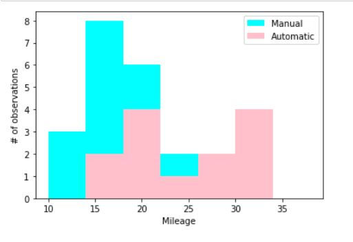
We can also remove the filled colors from the bins and make them transparent by defining histtype = "step"
fig, ax = plt.subplots()
ax.hist(manual_cars["mpg"],color = "blue",label = "Manual",histtype="step")
ax.hist(automatic_cars["mpg"],color = "green",label = "Automatic",histtype="step")
ax.set_xlabel("Mileage")
ax.set_ylabel("# of observations")
ax.legend()
plt.show()
Boxplots
Boxplots are used to view the distribution of our data and to identify any outlier observations.
We have used boxplot( ) function to create boxplot for mileage
fig, ax = plt.subplots()
ax.boxplot(mtcars["mpg"])
ax.set_ylabel("Mileage")
ax.set_xlabel(" ")
plt.show()
In the following code we have created multiple boxplots (one for automatic and other for manual cars) in a single boxplot statement.
fig, ax = plt.subplots()
ax.boxplot([automatic_cars["mpg"],
manual_cars["mpg"]])
ax.set_xticklabels(["Automatic", "Manual"])
ax.set_ylabel("Mileage")
plt.show()


Comments